Urban Textures: Why Black and White Is the Natural Choice for Street Photography in Venice
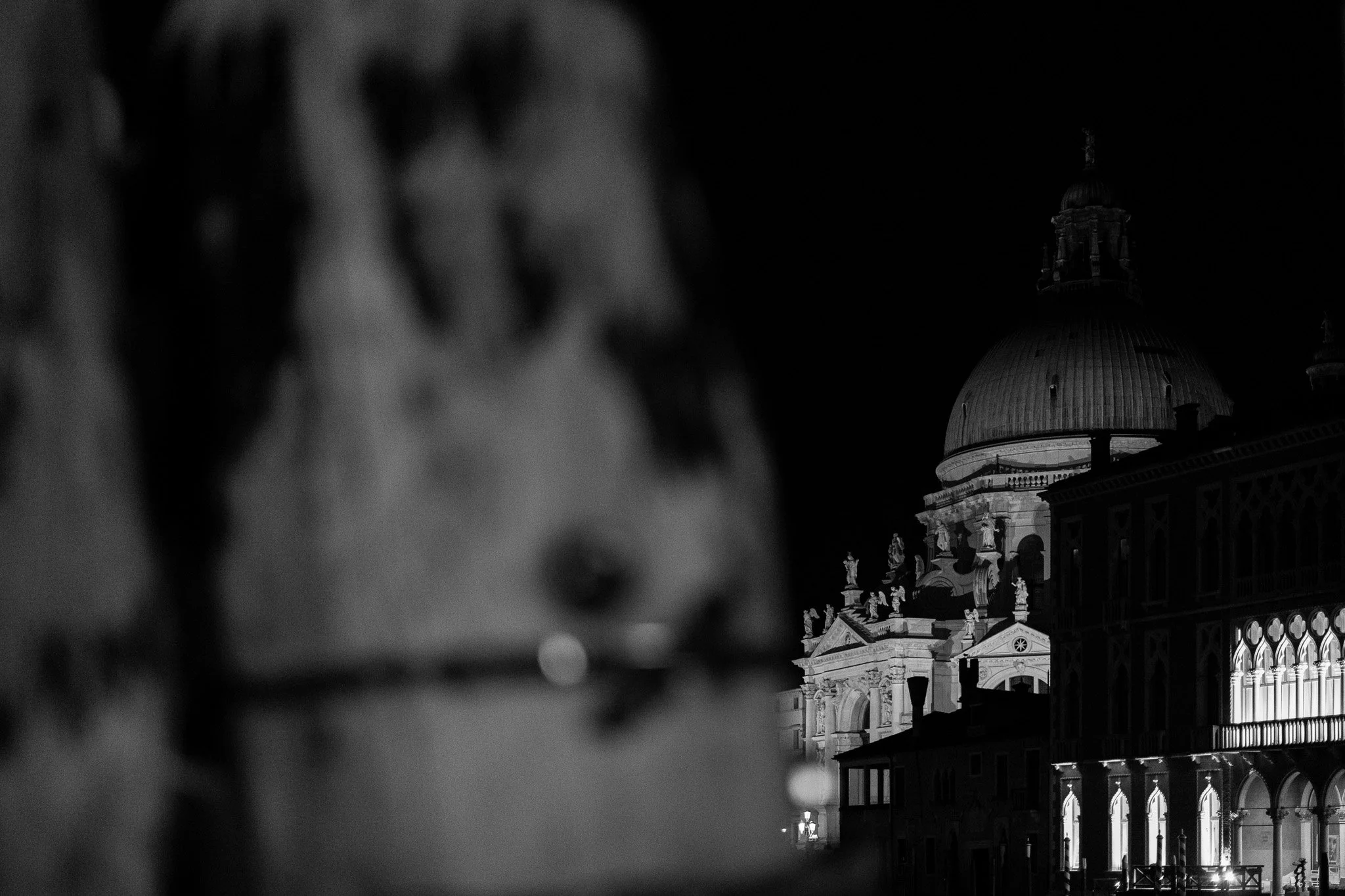
A Church Dome and Mooring Post in Venice.
Venice teaches you things about light that no other city bothers to. Narrow calli that dump you suddenly into wide-open campi. Canals that double every lamp and lit window into a second, wavering city on the water. Fog that rolls in off the lagoon and softens everything it touches. It's a city built, almost accidentally, for black and white street photography — and after a week of shooting there at night, I don't think I made a single frame I wanted to see in color.
Here's why.
Venice Is Already Working in Tone, Not Color
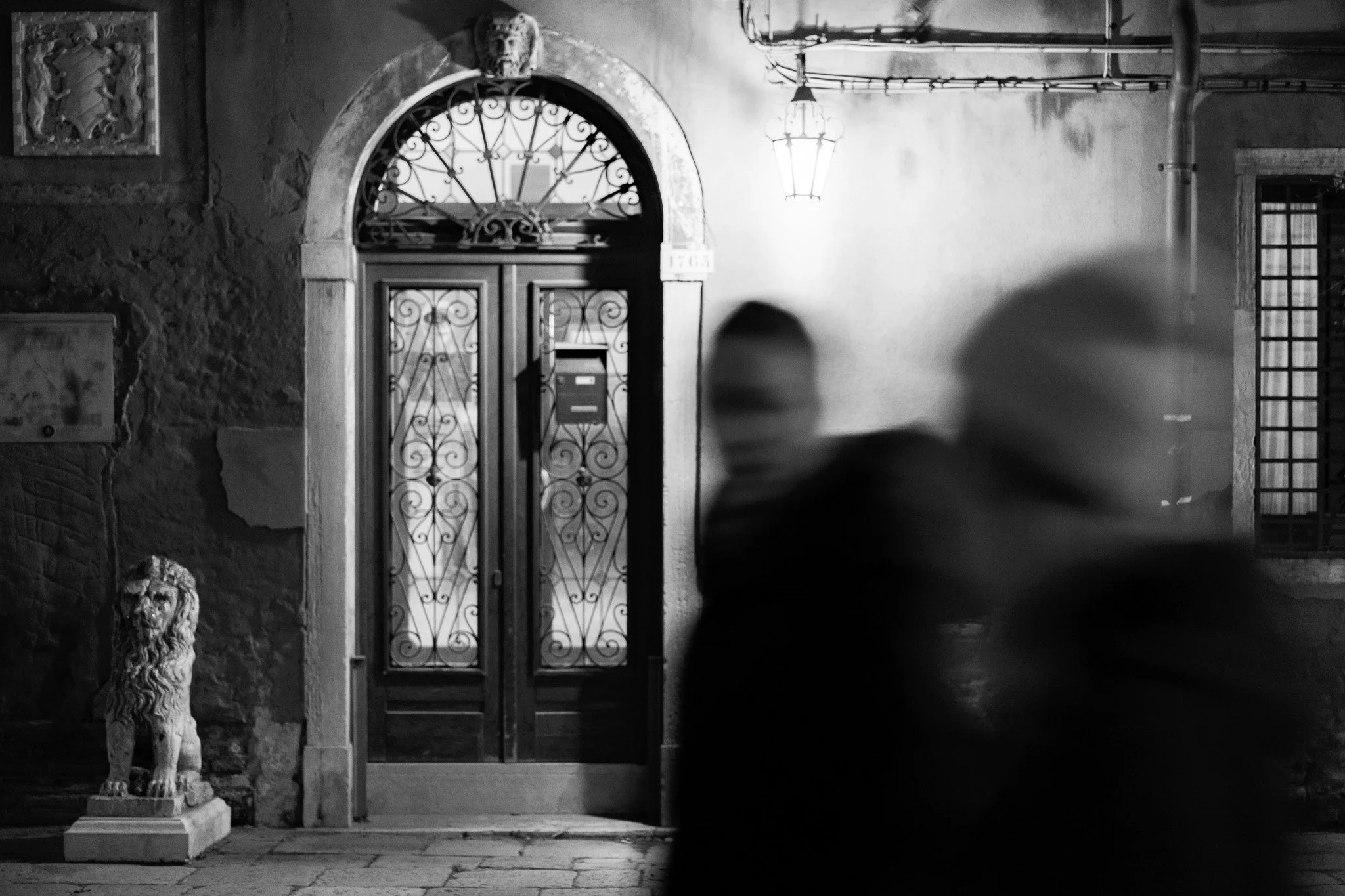
Blurred Pedestrians Walking by an Ancient Building in Venice
Most street photographers think about color as a compositional tool — a red coat against a gray wall, a yellow cab slicing through a crosswalk. Venice doesn't really give you that. Stone, water, plaster, brick: the palette is narrow and muted even in daylight, and at night it narrows further into pools of warm lamplight against deep, cold shadow. The city is already speaking in contrast and tone before you've made a single decision. Shooting in black and white doesn't strip anything away here — it just stops fighting what's already true about the place.
Look at the doorway on Campo San Barnaba, the ironwork catching the streetlamp while a lion statue sits in shadow at its base. In color, that frame is competing with itself — sandstone versus ochre plaster versus whatever temperature the streetlamp happens to be. In black and white, it's just shape, light, and the two blurred figures crossing in the foreground. The eye goes exactly where it should.
Night Photography and Monochrome Were Built for Each Other
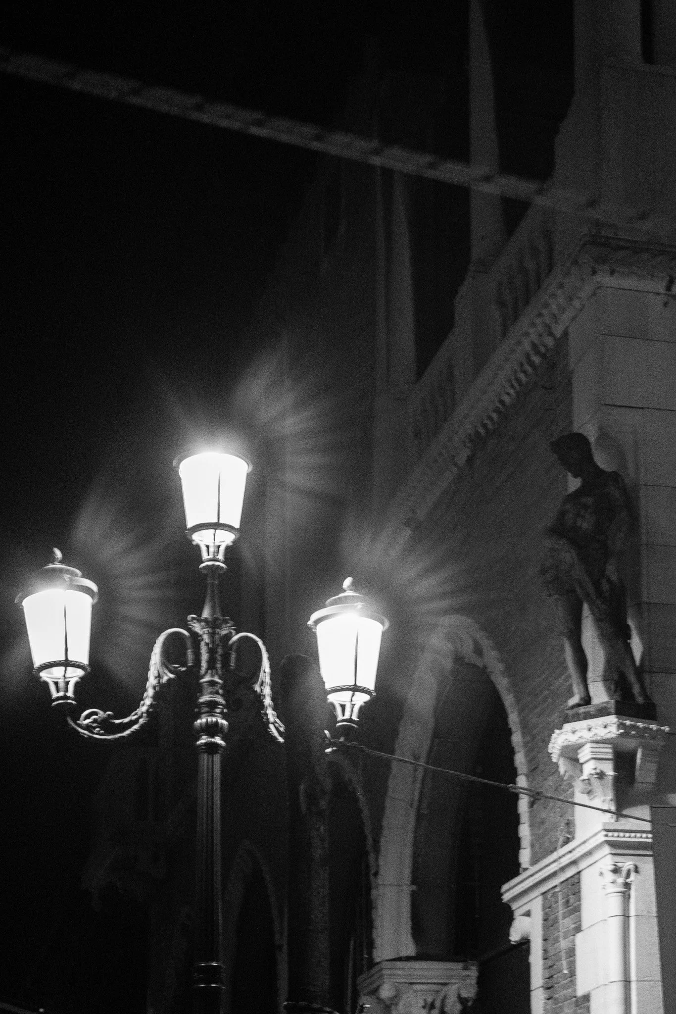
Detail of a Street Lamp and Classical Statue in Venice
I've written before about how I approach street photography at night — how the real work after dark is managing silhouette, reflection, and clashing light sources rather than just underexposing daylight technique. Venice at night is a concentrated version of that problem. Sodium lamps, boat lights, the cool wash of a floodlit façade, the warm flicker from a restaurant window — put all of that in color and you get a mess of competing white balances that no amount of editing fully reconciles.
Black and white sidesteps the whole argument. It converts every one of those light sources into the same currency: value. What matters is no longer what color the light is, but how bright it is and where it falls. That five-lamp cluster outside a Venetian palazzo, throwing wing-like shadows up a stone wall — the color version of that photo is fine. The black and white version is the photo.
Venice Rewards Shape Over Detail
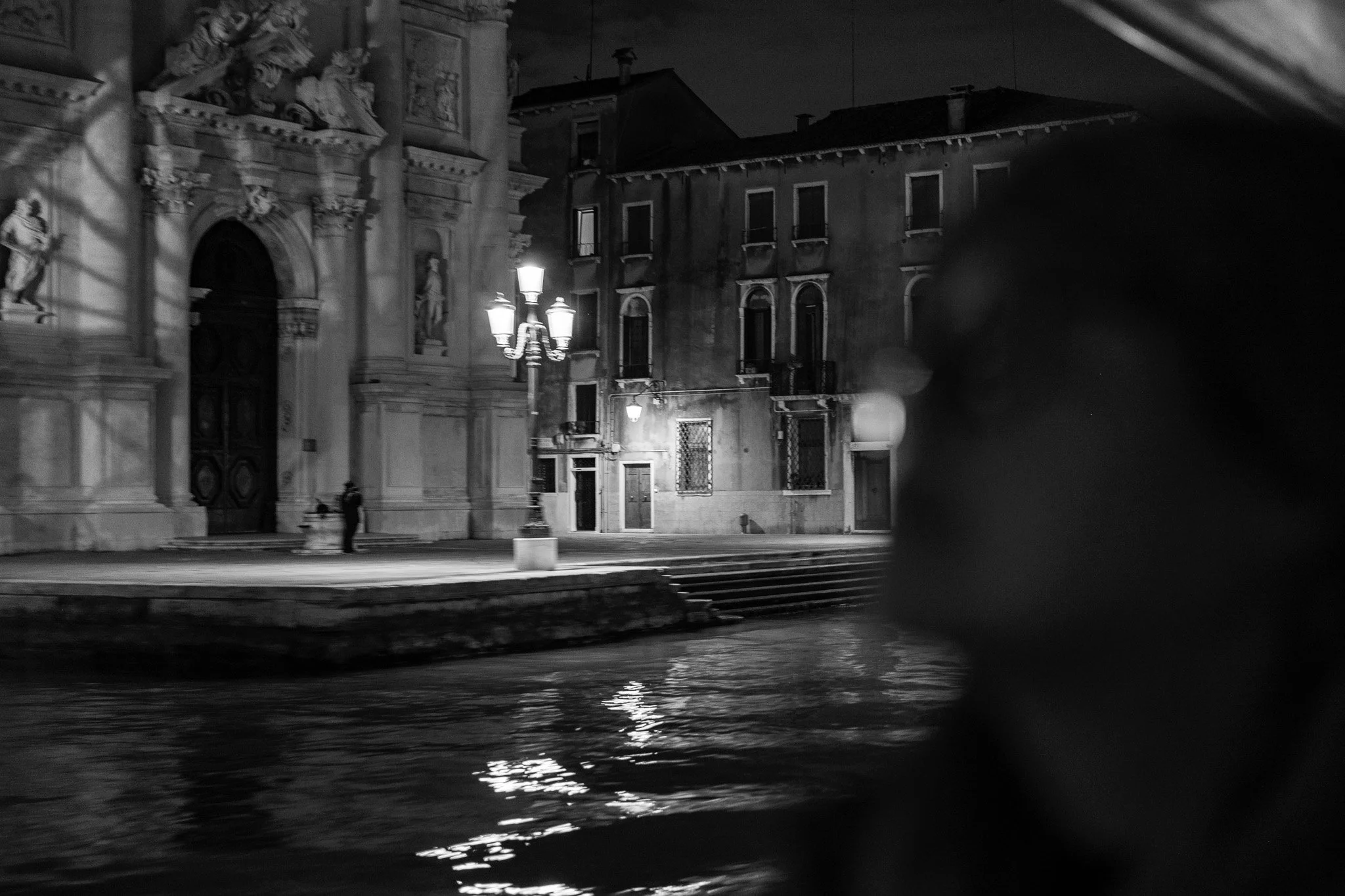
A Blurred Profile in Front of a Venetian Canal and Church
A lot of street photography depends on reading a scene quickly and reacting to gesture — the same instinct I lean on for Urban Textures work back in Venice and everywhere else I shoot. Venice adds a wrinkle: much of what makes a frame interesting isn't a person's expression, it's architecture. Domes, colonnades, the repetition of arched windows, a gondola's carved ferro cutting the frame like a blade. These are shapes first and details second, and monochrome is simply a better language for shape. Removing color forces the eye to read a silhouette, a dome against a black sky, a woman's outline passing in front of a lit restaurant awning, as pure geometry.
That's the case in the frame outside Vini da Pinto — a woman's silhouette crosses in front of a brightly lit restaurant façade, and the awning's typography becomes almost architectural in its own right. Strip the color out and the photo becomes about the shape she cuts against the light, not about what she's wearing.
Reflection, Fog, and Water Read Cleaner in Monochrome
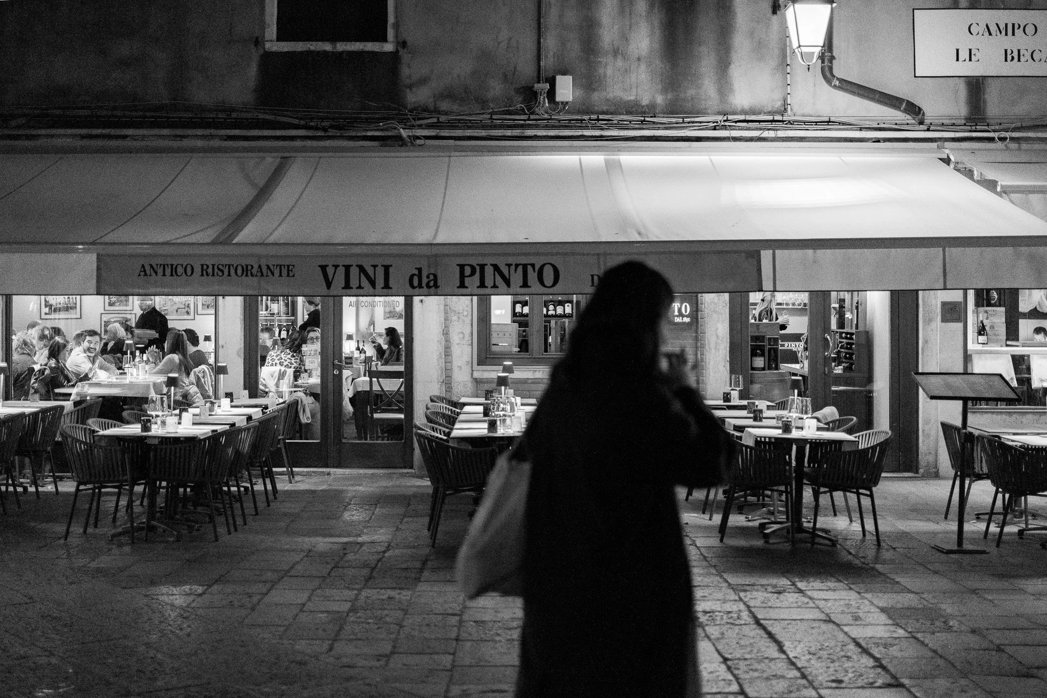
A Woman Silhouetted in From of a Ristorante in Venice
The lagoon adds a second image to almost every frame — light broken and doubled on the water. In color, reflections can get muddy, especially at night when the water is picking up three or four different light temperatures at once. In black and white, a reflection is just a reflection: the same tonal information, softened and rippled, without the added complication of color noise. The gondolas at dusk with the campanile of San Giorgio Maggiore in the distance work because the sky's gradient, the water's texture, and the boats' silhouettes all sit on the same tonal scale — nothing is pulling your eye away to ask "why is that patch of water orange."
Fog does something similar. Where color photography needs contrast to separate a subject from its background, black and white can use fog's natural desaturation to its advantage — a cathedral dome dissolving into a dark sky, a blurred architectural detail in the foreground doing exactly what shallow depth of field is supposed to do: get out of the way.
It's Also a Matter of Restraint
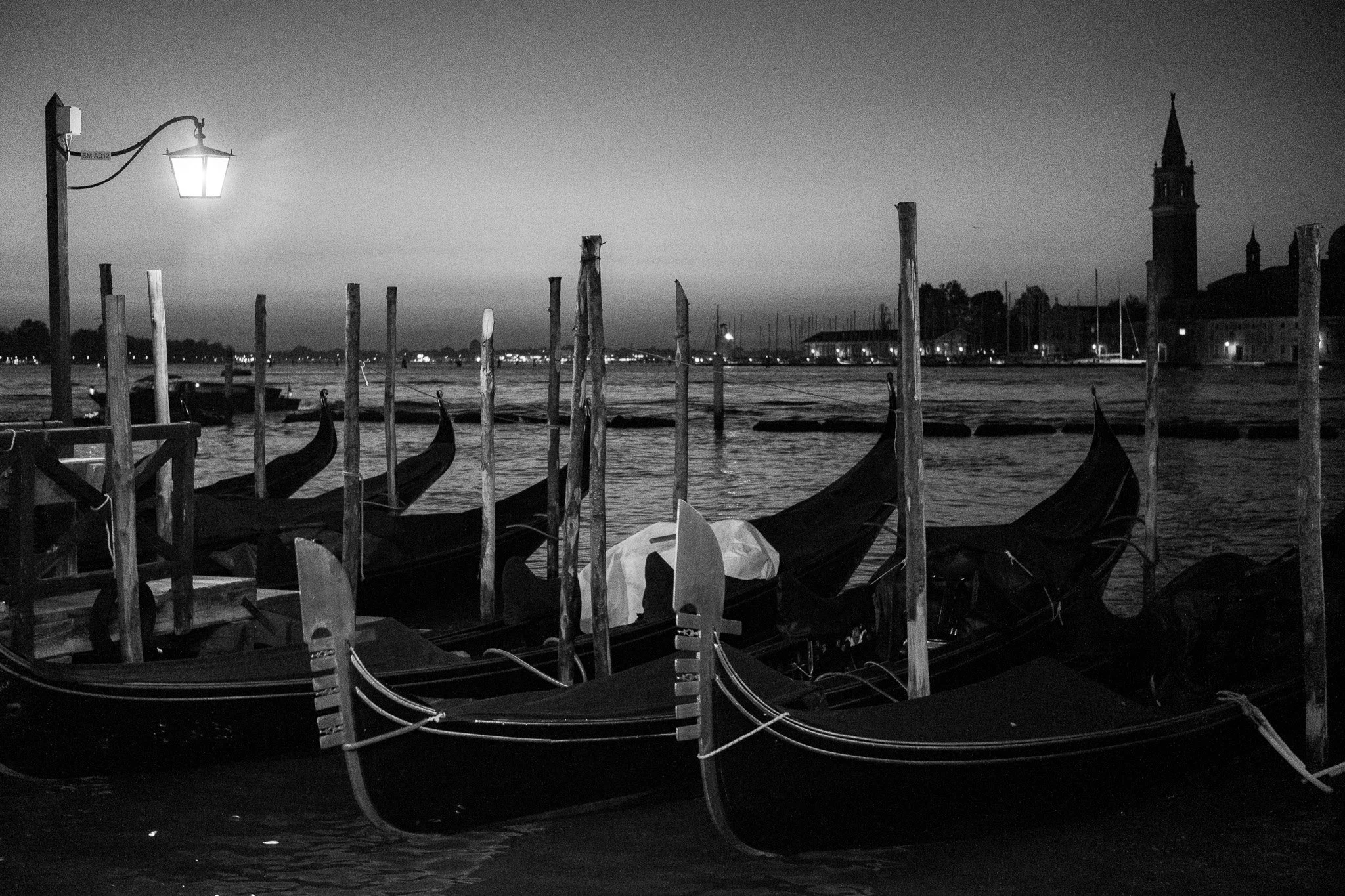
Gondolas Float in the Venetian Lagoon
I've talked before about stripping things back — simplifying camera settings so the process gets out of the way of seeing. Shooting Venice in black and white is the same instinct applied to post-processing rather than settings. Color is one more variable to manage, one more way a photo can be technically "right" but emotionally flat. In a city this visually loud — tourists, gondolas, reflections, ironwork, a thousand competing textures — monochrome is a way of saying: I'm not going to fight you for attention. I'm going to let the light and the shapes do the work.
That's the whole argument, really. Venice isn't a city that needs color to be beautiful. It needs someone willing to slow down, watch the light move across stone and water, and let black and white do what it's always done best — turn a place into a mood.